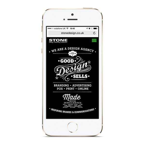
Our recent Honeybrook Family Farm & Riverside Park mobile website received such glowing reviews we thought we’d design a new smart phone version of our own site http://stonedesign.co.uk/mobile
We designed our own after we were so pleased with the mobile site we created for our client Honeybrook Family Farm & Riverside Park
In both cases, we decided a responsive desktop design just didn’t cut it in terms of design or user experience, so we built a distinct mobile site.
The mobile sites are simplified both in terms of content and navigation and focus on the information that’s really important – such as the organisation’s main message, contact details and recent news or portfolio updates. We use graphics, rather than images, so loading is quicker and uses less mobile data allowance, and we use one column meaning text is big enough to read just as it is presented – no zooming.
There are other differences. Our desktop site is our portfolio, a timeless record and showcase of much of the work we’ve done over recent years. Our mobile site allows us to focus on the here and now, and as it’s so easy to update, we’ll be using our landing page to explore of-the-moment trends in design communications, kicking off with lettering.
Why should you have a separate mobile site? User engagement is far lower on mobiles when they only display the regular desktop site, often vast amounts of information in tiny text that makes people give up before they’ve even begun. Even responsive desktops that resize text for mobiles can present a frustrating experience, particularly in terms of navigation. It seems like common sense that no organisation would want to alienate people in that way, but it’s amazing how many businesses have missed the opportunity to engage with clients and increase sales with a mobile site. In short, good design sells.
There’s no downside and no compromising of the main website – thanks to the browser detect function written into the code of the regular desktop site, mobile users are seamlessly redirected, with an option to view the full website if they choose.
The good news is that we’ve got you covered, whether you need a website refresh or an entirely new online presence incorporating desktop, mobile and social media, too. And what’s really great is that we offer our clients in-browser editing, meaning you can easily and quickly update your website – great for updating imagery and posting news – giving your customers a reason to keep coming back for refreshed content. With in-browser editing, you’re in control and your on-going costs are reduced.
To talk website design, or indeed any kind of design, we’d love to hear from you: email tara@stonedesign.co.uk call +44 (0)1425 480070 or visit http://www.stonedesign.co.uk/

 Stone Design Studio