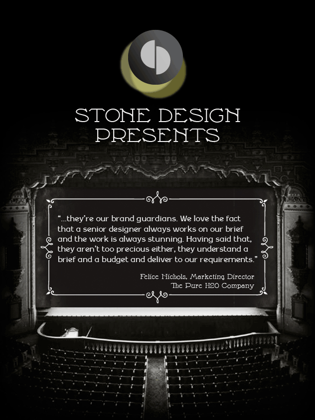
 We’ve had some blockbuster reviews from our clients – the critics that matter most – and showcased our favourites on the silver screen as an animated gif in our recent August email newsletter. To see why our name’s up in lights read the reviews in full here.
We had great fun researching and designing the silent movie theme, learning all about intertitles and the typography of the era. Its interesting to see how well the style and designs of these title cards fit with the recent trend for all things hand drawn and nostalgic in typography. Go to our earlier posts ‘Good Design Sells’ and ‘Sign o’ the times’ to read more about the revival in letterpress and wood type craft.